

Short answer: the paint colours to sell a house — or to rent one quickly — are the same across the GTA: a warm white or a light greige on every wall, flat white on the ceilings, white semi-gloss or satin on the trim and doors, one palette from the front door to the basement. Stagers choose it because it photographs bright, makes rooms read larger, goes with any floor and any furniture, and gives a buyer nothing to argue with. Landlords choose it because it touches up invisibly and works in every unit. Below is why it works, how to adjust it room by room and by which way the windows face, what to avoid, how to test a colour before committing, and what a dark colour actually costs to paint.
| Surface | Colour | Sheen | Why |
|---|---|---|---|
| Walls (living areas, bedrooms, halls) | Warm white or light greige, one shade throughout | Eggshell (matte on old plaster) | Bright in photos, hides roller marks, washable for tenants |
| Walls (kitchen, bathrooms, basement) | The lightest version of the same neutral | Eggshell or satin, moisture-resistant in bathrooms | Low light and wet rooms need reflectance and wipeability |
| Ceilings | Flat white | Flat | Hides lap marks and small flaws under pot lights |
| Trim, doors, baseboards | One white, matched to the ceiling white | Semi-gloss or satin | Hard-wearing, wipeable, crisp edge against the walls |
Selling: what a stager is doing
A stager’s job is to make a listing photograph well and let a buyer picture their own things in the space. Paint does most of that work. A single light, warm neutral throughout means the camera sees one bright, continuous space rather than a sequence of rooms with different personalities; it makes small rooms look bigger and low ceilings look higher; and it hides the previous decade — the accent wall, the burgundy dining room, the child’s bedroom — that a buyer would otherwise mentally deduct from the offer. Warm undertones matter because Ontario daylight is cool and grey for half the year; a stark, cold white can look blue and clinical in a north-facing living room in February, while a white with a touch of warmth looks clean.
Room by room
- Living and dining rooms — the main neutral on the walls, flat white ceiling, crisp white trim. If there is a fireplace wall or built-ins, they take the trim colour, not a feature colour.
- Kitchen — the same wall colour, chosen against the cabinets and counter; a warm white next to cream cabinets, a greige next to white ones so the cabinets still read as white.
- Bedrooms — the same neutral, or a barely-there cooler version for a calmer feel; never a saturated colour before a sale.
- Bathrooms — the lightest version of the palette, in a moisture-resistant finish, against white fixtures and tile.
- Basement — the lightest neutral you have, because there is little natural light; a bright, dry-looking basement is one of the things buyers check.
- Trim, doors and baseboards — one white, one sheen, everywhere. What that costs and why it is priced apart from walls is in our guide to painting trim, doors and ceilings.
What stagers avoid
Accent walls, which make a room look smaller in photos and date instantly; saturated colours of any kind; glossy wall paint, which shows every roller mark and flaw under listing photography; and mixing several neutrals through the house so the rooms fight each other. If a colour makes you say “I love it”, it is probably a colour a buyer will want to change.
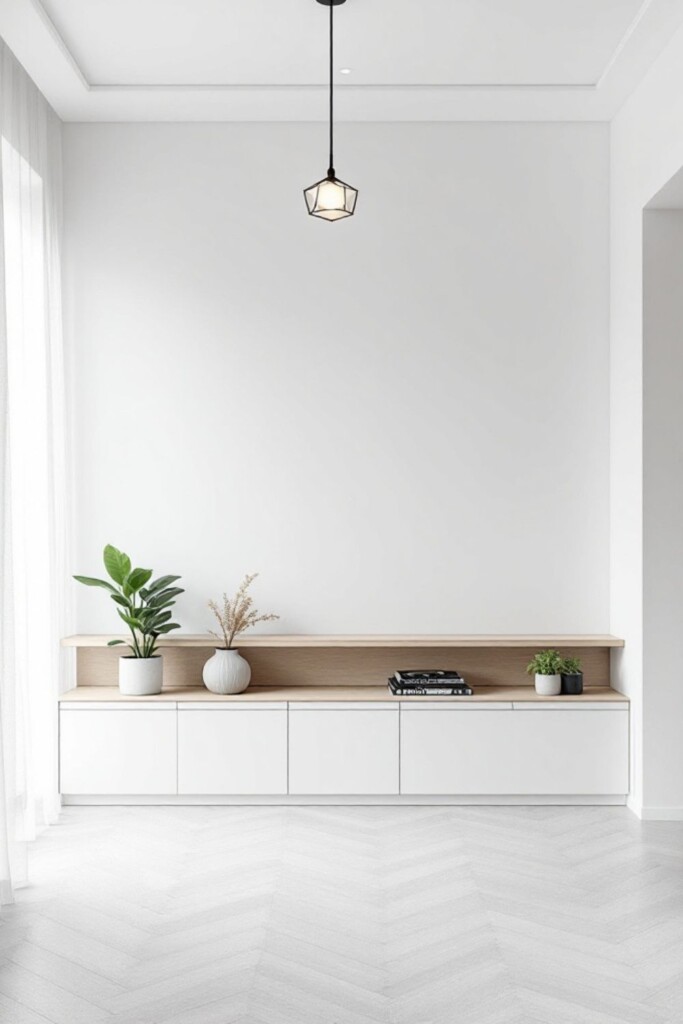
Renting: durability first
A rental repaint is about the next five turnovers, not the next listing photo. Three rules landlords in the GTA settle on:
- One colour for every unit you own, and write the brand, name and code on the inside of a closet door and in your records. Touch-ups then match, and a partial repaint between tenants is possible instead of a full one.
- A washable eggshell on the walls — flat paint scuffs and cannot be wiped; eggshell survives a tenancy and cleans up. Semi-gloss on trim and doors for the same reason.
- Neutral and light, for the same photography reasons as a sale, and because a dark unit rents slower.
Between tenants, the repaint is a scheduling problem as much as a painting one; how many days a unit takes and when furniture can go back is in our guide to how long interior painting takes. Condo landlords in the city also work around building rules and elevator bookings — the details are in our guide to condo painting in Toronto.
North-facing rooms, small condos and windowless basements
The same colour looks different in every room because the light is different. The principle is light reflectance: a lighter colour bounces more of the available light back into the room, a darker one absorbs it. So in a north-facing room, a small condo with one window, or a basement with none, choose the lighter and warmer end of the palette — the warmth counters the grey light and the lightness makes the most of it. In a south- or west-facing room with big windows, the same warm white can look yellow in the afternoon, and a slightly cooler or greyer neutral holds its colour better. Hallways and stairwells with no windows take the lightest colour in the house.
How to test a colour
Never choose from a chip. Buy colour samples of two or three candidates, paint large swatches — the bigger the better — on two walls of the room, one that gets direct light and one that does not, and look at them in the morning, in the afternoon and under the room’s lamps at night. Put the swatch next to the floor, the kitchen counter and the biggest piece of furniture that is staying, because undertones show up against other undertones: a greige that looks neutral on its own can turn pink next to oak flooring or green next to a cool grey tile. Leave the swatches up for a few days. The colour that looks right in every light is the one; the colour that looks spectacular at 4 p.m. and dull at 9 a.m. is not.
Dark colours: when they are worth it and what they cost
Deep navy, charcoal, forest green and near-black are legitimate choices in a home you are living in — a study, a dining room, a powder room — and they look their best on a Level 5 wall under a satin or eggshell sheen. Two practical notes. First, they are not for a sale or a rental, for the reasons above. Second, they cost more to paint: dark and saturated shades need a tinted primer or a third coat to cover evenly, and going back to a light colour later needs the same. Among our packages, Premium is built for it — stronger coverage on darker shades, plus a free colour consultation — while at Standard an extra coat appears as a line on the quote. The per-square-foot rates are on our interior painting page and the room-by-room budgets in our guide to interior painting cost in Ontario.
What a colour consultation includes
If choosing is the part you would rather not do alone: the Premium package includes a free colour consultation by our team — the candidate neutrals for your light and floors, narrowed to two or three to sample — and Signature projects begin with an in-depth colour consultation that settles the whole palette in your own light, trim and ceilings included. Either way the colours go on the written quote by name and code, so the paint that goes on the wall is the paint that was chosen.
Across the GTA
The palette is the same; the houses are not. Toronto’s pre-war semis and century homes have tall trim and plaster walls where a warm white in a matte finish flatters the imperfections — see interior painting in Toronto. Mississauga’s 1980s–2000s houses with oak floors and oak trim need a neutral chosen against that orange undertone — see interior painting in Mississauga. Brampton’s newer builds come with builder-grade flat white that scuffs easily and is usually the first thing a new owner or landlord replaces — see interior painting in Brampton.
IntraBuild paints across Toronto, the GTA and Southern Ontario with one insured crew, a written price within 48 hours, the paint named on the quote and no travel fee. Get an interior painting quote or call (647) 558-8723.
Frequently asked questions
What is the best paint colour to sell a house in 2026?
A warm white or a light greige on every wall, flat white ceilings, white semi-gloss trim — one palette throughout. It photographs bright, suits any floor and furniture, and gives buyers nothing to redo. The exact shade is chosen against your floors and light, which is what sampling is for.
Should all rooms be the same colour before selling?
Yes, or as close as the light allows — the same neutral, perhaps a lighter version in dark rooms. One continuous colour makes the house read as one bright space in photos and in person.
What sheen should rental walls be?
Eggshell — washable enough to survive a tenancy, low enough sheen to hide roller marks and patches. Semi-gloss on trim and doors. Flat paint is for ceilings only.
Are grey walls out of style?
Cool, blue-toned grey has given way to warmer neutrals — greige and warm whites — because cool grey looks cold in Ontario’s winter light. A grey with a warm undertone still works; a steely one reads dated in photos.
Do dark colours cost more to paint?
Yes. Dark and saturated shades need a tinted primer or an extra coat for even coverage, and so does painting over them later. Premium package includes stronger coverage on darker shades; with standard-quality paints the extra coat is a separate line on the quote.